Checklist for a high-converting Pardot landing page
This guest post was written by Lisa Mullis of Paraphrase Communications. As a copywriter and designer, Lisa helps service-based businesses and nonprofit leaders define their brand positioning, develop all the messaging around it, and put that into the context of website design and build. Her message-first approach makes outreach much more effective and easier to do so clients see real growth in income and impact.
You and your team have put in a lot of work to develop a great offering. You’re doing everything right in terms of attracting and nurturing your leads. You’ve provided value all along the way, generating real motivation for your leads to become customers.
Now they’re finally here, at your Pardot landing page, ready to fill out that final form. So it’s is nothing short of frustrating when they don’t buy. When they don’t sign up, don’t book the call, don’t make a donation.
What went wrong?
There are lots of things that can go wrong on a page, even seemingly small things will have folks bouncing off before they click ‘buy’.
But it’s also easy to create a landing page that includes all necessary elements arranged in a pleasing flow that leads your soon-to-be new customer toward a logical decision that they feel good about.
Before we get into the individual components of a great landing page, there are a couple of foundational concepts to cover.
First is the structure for the content on your page. Underpinning the arc of the information you provide is the Problem-Agitation-Solution (PAS) Formula, one of the most effective frameworks for conversion copywriting. You start by acknowledging the customer’s pain points (problem), go deeper into them through compare and contrast (agitation), and then share how that problem can be fixed and what that will mean (solution).
Second is the length. People always wonder how long a landing page should be (or any bit of marketing copy for that matter). While the answer “as long as it needs to be” is true, it isn’t super helpful.
Instead, consider how complex your offering is and where your prospect is in their journey towards becoming your customer. Typically if your offering is complicated, a very new concept, or requires a significant investment of time or money, your landing page will be on the long side.
The Pardot landing page checklist
Now let’s get into a rundown of the key components for your landing page. The order here is intentional, as it reflects generally where you want to place the content on your page as you’re designing it from top to bottom.
Must have items:
✓ Header banner
✓ Problem
✓ Agitation
✓ Solution
✓ Features and Benefits
✓ Pardot Form
✓ Legalese
Optional items:
✓ Pricing
✓ Social Proof
✓ About
✓ Risk reversal
✓ FAQs
✓ Images
Must have items:
Header banner
Rather than kick off the page with the name of your product/program/service, emphasize the big outcome that someone gets as a result of your offering. Since it can be hard to fit all that into a snappy headline, use a subhead, which can be longer, to further bolster the message.
If you’re struggling to come up with language, look to customer testimonials. Sometimes you can use a phrase directly from a testimonial as your headline. Letting others speak on your behalf can be quite a powerful way to start.
Tip: Including the form at the top of the page can accommodate those folks who are ready to purchase and don’t want or need to read your entire landing page.
Example:
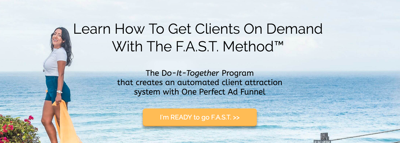
I Speak Social
Problem
The entire landing page is about your potential customer, so it’s important to demonstrate you understand their present challenges and aspirations, that you see their pain and can empathize. You can either state the problem in a sentence or two or list a number of specific pain points.
For prospects rather new to you and your offer, this will create a connection. For those who are familiar with you, acknowledging the pain points will strengthen their trust in your ability to solve the problem since it’s obvious you know it well.
Example:
StoryBrand
Agitation
Next describe what it means to have this problem continue, the opportunity costs. What has the customer already tried to fix the issue? What could the customer do instead that might help solve the problem but would still not be an ideal solution? What have others done to address the problem that didn’t work?
Example:
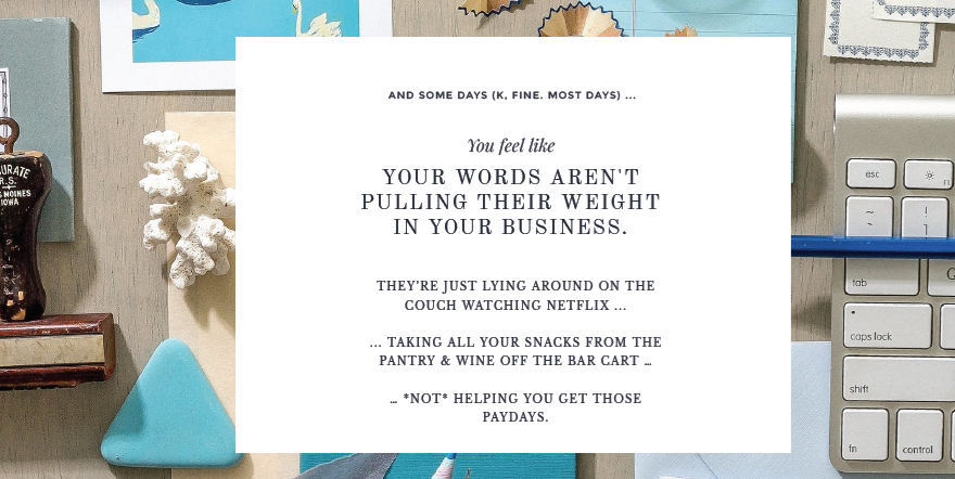
Ashlyn Writes
Solution
In this section, you want to emphasize or expand on the outcome(s) you hinted at with the headline and subhead. This should paint a compelling, desirable contrast of life after the customer’s problem has been fixed. Now is the time to formally introduce your offering connecting the outcomes you’ve just described directly to how they can be specifically achieved through your offer. Showcase how awesome your offering is by listing all the benefits.
Example:
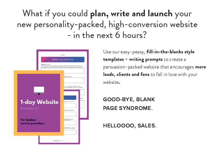
Zag Studios
Features
Once you’ve introduced your offering and described its benefits, you’re ready to detail the particular features. For physical products, this will be all the attributes that make it what it is and do what it does (think how Apple spells out the features of the iPhone or iPad). For services and programs, features could be the steps in the process from start to finish, the format of delivery, number of meetings, deliverables, etc.
Example:
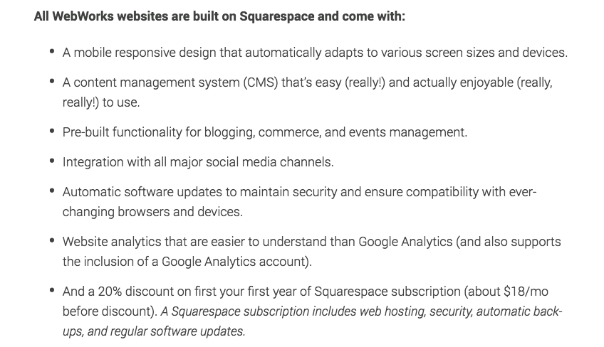
Paraphrase Communications
Repeat the outcome
After you’ve laid out all benefits and features, tie everything back to the main outcome. Remind people of the primary result they can expect when they choose to buy. Remember, everyone who buys anything is buying a transformation of some sort.
Example:

Hillary Weiss
Form
This is your call to action. Your ultimate goal of this page is for them to fill out the form. Studies show that you can see 50%, 60% even 70% or more increase in conversion simply by changing the button text to something that either speaks to results, is infused with personality, or is specific. You don’t need to get too fancy with this. Be clear and direct.
Example:
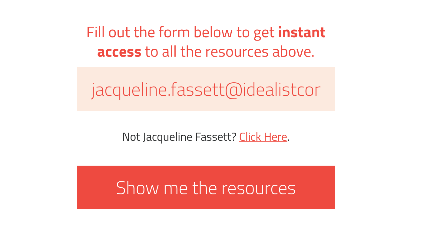
Idealist Consulting
Legalese
The final must have. Don’t forget the important legalese like copyright, disclaimers, privacy policy, terms, or other information that clarifies ownership, contractual responsibilities of each party, and refund procedures.
If you have a custom-made template in Pardot you should have this all set up so you don’t have to double your work.
Optional Pardot landing page components
What about testimonials or FAQs? What about guarantees? Though not required to create a great landing page, these sections can dramatically improve the conversion rate so consider including them when possible.
Pricing
While optional based on your company and sales strategy, this could be the crux of the page.
There are a number of strategies for presenting the cost of your offering that can significantly improve sales. These include price anchoring (having 2-3 different price levels), price comparison (against the competition), price metaphors (i.e. “same as what you spend each week at Starbucks”), and payment plans.
Choose one strategy and experiment. If your landing page is long, consider listing the price more than once.
Example:
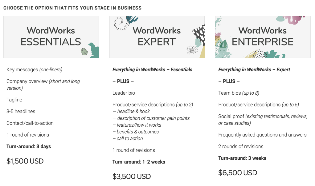
Paraphrase Communications
Social Proof
Social proof refers to the real-life evidence that your product/program/service gets the results you promise. It’s powerful to have your customers speak on your behalf through written testimonials, video testimonials, third-party reviews and ratings, case studies or any combination of these. Scatter these throughout the landing page but do so with intention, attempting to match the testimonial with whatever problem, benefit, or objection you’re discussing at that point.
About
About pages on websites are some of the most viewed, no matter what industry. People want to know who’s behind the scenes. If you’re directly involved in delivering the program or service, include a brief bio and some qualifying statements to help bolster the know-like-trust-factor of your pitch. If you’re selling a product and you have an interesting origin story that kind of insight can strengthen the connection and confidence the prospect feels about you.
Risk reversal
Do you offer a money-back guarantee? Do you give an incentive for completing your program within a certain timeframe or a discount for buying sooner than later? If you’ve done your research and you know what aspects of your offer feel most risky to prospects, see if you can find ways to make them feel more comfortable about their buying decision.
FAQs
The goal with a FAQs section is to anticipate concerns and thereby reduce friction in the decision-making process. What questions do you hear from your would-be customers? If this landing page is for something new, brainstorm all the possible objections someone might have to buy with you.
Images
Without diving into an entirely new topic—the design of a landing page—I’d be remiss not to include imagery in a content checklist for a landing page. While not required to have an aesthetically pleasing, highly engaging page, using images can help clarify and support the message. Photos of your product, your customers, your team, your workspace, and depictions of the transformation you promise are all good options.
If you have custom photography to work with, that’s excellent. If your only option is stock, be mindful to choose high-quality imagery with natural lighting, composition, and models. Unsplash is full of such examples with all images free to use so it’s a great place to start your search.
Get a free copy + layout template for a high-converting landing page. Includes writing prompts for each of the essential section and a proven arrangement of page elements.
The landing page is never about the thing you’re selling.
It’s about the transformation you’re promising. With this checklist and following the structure outlined, you’ll be able to lead them through a natural flow without feeling sales-y or pushy. By keeping the focus on them you’ll build greater empathy and trust bringing them to a decision to buy that feels both logical and good.
Want to read more Pardot content like this?
Our monthly Pardot newsletter dishes up tips and tricks from Pardot experts around the web, just like this one. You can subscribe through the link below.

